
How to use ChatGPT- 4 to Visualize Data?
June 3, 2024
JazzCash Surpasses 11 Million Active App Users
June 10, 2024In the competitive landscape of market research and data analytics, Power BI emerges as a game-changer. Gallup Pakistan Digital Analytics harnesses the combined power of Power BI and Mapbox to visualize district-level PSLM (Pakistan Social and Living Standards) 2018 household data, offering a detailed, interactive view that enhances data-driven decision-making.
Power BI and Mapbox: A Perfect Match
Power BI is a leading business analytics service by Microsoft, known for its powerful data visualization capabilities. Integrating Mapbox with BI allows for advanced geographic visualizations, transforming raw data into interactive maps that provide valuable spatial insights.
Why Gallup Pakistan Digital Analytics Chose Power BI and Mapbox?
We needed a solution to visualize extensive PSLM household data across various districts. By using this combination, we could:
- Enhance Data Visualization: Create detailed and interactive maps.
- Improve Data Interactivity: Allow users to explore data dynamically.
- Customize Visuals: Tailor maps to specific needs and preferences.
- Scale Efficiently: Handle large datasets with ease.
Visualizing PSLM Household Data
Step 1: Preparing the Data
Gallup Pakistan Digital Analytics started with preparing their PSLM household data, ensuring it included district codes.
Step 2: Setting Up Mapbox
- Sign Up for Mapbox
- Generate Access Token
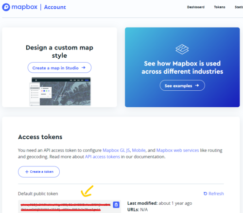
Step 3: Importing Mapbox Visual to BI
- Open Power BI Desktop: Load PSLM dataset.
- Import Mapbox Visual: From the Visualizations pane, add the Mapbox visual from the Microsoft Marketplace.
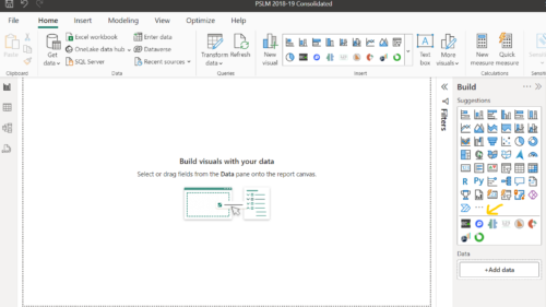
Step 4: Configuring Mapbox in BI
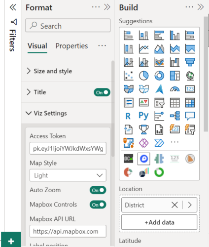
- Drag Mapbox Visual: Drag the Mapbox visual onto the report canvas.
- Map Fields: Map Latitude and longitude fields to the respective placeholders in the Mapbox visual.
- Enter Access Token: Paste Access Token field in the Format pane.
Step 6: Interacting with the Map
- Zoom and Pan: Navigate across districts easily.
- Apply Filters: Use filters to focus on specific data points.
- Hover and Click: Access detailed information through tooltips and popups.
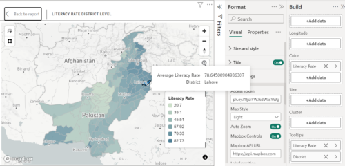
Gallup Pakistan Digital Analytics’ successful use of this integration to visualize PSLM household data highlights the transformative potential of GIS in business intelligence. By following these steps, other organizations can leverage this powerful combination to enhance their data analysis and visualization capabilities.
Whether you’re analyzing market trends, customer demographics, or regional performance, integrating Mapbox with Power BI can provide the geographic insights needed to make data-driven decisions. Embrace the power of GIS in Power BI today and see how interactive, customizable maps can transform your data analysis
